| 26.06. - 05.09.2009 | Nora Schultz & Pernille Kapper Williams |
|
<< zurück
Nora Schultz & Pernille Kapper Williams Ausstellungsdauer / Duration of the exhibition
(for english version please scroll down)
Die Ausstellung zeigt neue Arbeiten der Künstlerinnen Nora Schultz (*1975, lebt in Berlin)
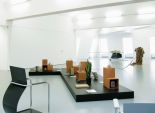
Poesie ist bei Kapper Williams ein Spiel mit der Rhetorik von Publikation und Vermittlung. Durch ihre Arbeit stellt sich die Frage, wie die Bedeutung von Dingen mit deren jeweiligen Gestaltungs- und Präsentationsformaten verknüpft ist. Die Träger, Sockel und Rahmungen, mittels denen Ideen, Inhalte, Kunstobjekte aber auch Konsumprodukte kommuniziert und verteilt werden, sind das Ausgangsmaterial ihrer Objekte und Bilder. Die Konfrontation damit, wie gestaltete Oberflächen, die unseren Alltag ausstatten, konstruiert sind und was sie dabei über sich und über uns vermitteln, stellt die Künstlerin durch ästhetische Eingriffe, hintergründige Reduktionen oder ungewöhnliche Kontextualisierungen her. Sprache erscheint bei Kapper Williams meist als Textmarke oder als durch Rahmung neu editierter Text, als Design für ein fiktives Buch oder auch einfach als Stapel unbedrucktes Papier. Pernille Kapper Williams, Du Bon Ton, 2009
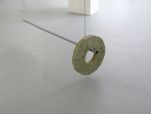
Nora Schultz Die Arbeiten von Nora Schultz entstehen im Umgang mit gesammelten Materialien, gefundenen Gegenständen, Texten oder Zeichen. Es sind Auseinandersetzungen mit der Visualität dieser Dinge und den damit verknüpften räumlich-sozialen Zusammenhängen. Formale Eigenschaften, Gewicht, Funktionen oder Bedeutungen werden im ästhetischen Spiel der Bearbeitung, Umgestaltung, Verschiebung, des Nachbaus oder der Umnutzung als Träger und Repräsentanten von kultureller Realität verformt und umcodiert. Bildhauerische Ansätze vermischt Nora Schultz mit den Möglichkeiten der Performance, der Druckgrafik, der Textproduktion und der Fotografie sowie mit verschiedenen diesen Medien angeschlossenen Präsentations- und Reproduktionsformaten. Ihre mit Blick auf ein bestimmtes visuelles Resultat häufig offen angelegten Produkte sind wie Experimente aufgebaut, die den Aspekt der Produktion betonen und nicht selten wie Abschnitte eines fortlaufenden Arbeitsprozesses erscheinen.
In ihrer Arbeit stellt sich die Frage, wie die Bedeutung von Dingen mit deren jeweiligen Gestaltungs- und Präsentationsformaten verknüpft ist. Die Träger, Sockel und Rahmungen, mittels denen Ideen, Inhalte, Kunstobjekte aber auch Konsumprodukte kommuniziert und verteilt werden, sind das Ausgangsmaterial ihrer Objekte und Bilder. Die Konfrontation damit, wie die Oberflächen, die unseren Alltag ausstatten, konstruiert sind und was sie dabei über sich und über uns vermitteln, stellt die Künstlerin durch ästhetische Eingriffe, hintergründige Reduktionen oder ungewöhnliche Kontextualisierungen her. Wie entsteht Bedeutung? Sprache erscheint bei Kapper Williams meist als Textmarke oder als durch Rahmung neu editierter Text, als Design für ein fiktives Buch oder auch einfach als Stapel unbedrucktes Papier – abwesend.
Minutiös recherchiert sie in einem ihrer Projekte die ästhetischen, ökonomischen und biografischen Hintergründe für das Zustandekommen einer ganz bestimmten Buchcovergestaltung. Grafische Elemente des Buchdeckels werden isoliert und als Wandmalerei umgesetzt, die später als ein Element von Ausstellungsarchitektur in ihrer Einzelausstellung dient. Auch Standardformate der Kunstpräsentation wie Sockel und Vitrine finden sich in ihren Arbeiten immer wieder neu durchgespielt, zitiert oder – wie bei einer Reihe von unterschiedlich konstruierten und hochglanzlackierten Sockeln – einfach als Objekte an sich ausgestellt. Design, Ornament und Oberfläche sowie Sprachen der Präsentation und des Displays interessieren Kapper Williams als Resultate von Entscheidungsprozessen, anhand derer sich komplexe politische, historische und kulturelle Vereinbarungen sowie deren Widersprüchlichkeiten, Konstruktionen und Mythologien ablesen und analysieren lassen. Ihre Typografie- und Textarbeiten, Objekte oder semifiktiven Annährungen an das Leben und Werk bestimmter Persönlichkeiten haben trotz ihrer reflexiven Immanenz immer zugleich auch den Sinn für das Paradoxale und für das Potenzial der Einbildungskraft des Betrachters, die vermutlich die besondere Sensibilität von Kapper Williams‘ Arbeiten ausmachen.
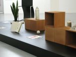
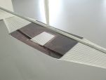
Eine nicht definierte Anzahl von Blättern herkömmlichen Kopier- bzw. Druckerpapiers ist auf die Höhe eines Meters gestapelt. Die Kanten schließen einheitlich ab, so dass ein aufrechter Kubus entsteht, der zugleich Assoziationen an einen leeren Sockel im Raum der Ausstellung weckt. Der Stapel ist auf einer rechteckigen, schwarz durchgefärbten MDF Platte positioniert, die am Boden liegt. Die Arbeit veranschaulicht ein wichtiges wiederkehrendes Motiv innerhalb der Arbeit von Pernille Kapper Williams, das in dem Reiz besteht, Vorstellungen potenzieller Handlungen oder Zusammenhänge zu evozieren, deren kommunikative Wirkung sich nur durch die Einlassung jedes einzelnen Betrachters realisieren lässt. Ihre Textbilder und Skulpturen sind als fundamentale Kritik an dem Verlangen zu verstehen, zu kontrollieren, Zugriff zu haben oder zu besitzen. Sie produzieren bewusst Spannungen, die zwischen dem gebotenen Artefakt, seinen Anspielungen und der geforderten Aktivität der Betrachter liegen. Der Stapel Papier ist nicht nur Metapher für das unvollendete Projekt, die „noch ungeschriebenen Texte”, sondern auch für den Sockel, den potenziellen Ort des Werks, der immer wieder variiert in verschiedenen Arbeiten von Williams erscheint und mit dem der Betrachter nicht selten allein bleibt. „579m2 or 0,061m3 or 1m Pile of Unwritten Writings” führt aber auch die visuelle Präzision der Künstlerin und ihren genauen Blick für das Detail vor. Durch die Stapelung werden notwendigerweise die Schnittkanten des standardisierten Kopierpapiers in einer Menge sichtbar, die man im Alltag nicht kennt. Erst durch diese Anhäufung treten die verschiedenen Schattierungen in das Blickfeld wie die unterschiedlichen Schichten einer Tortenfüllung. So stellt die Skulptur die Variationen bzw. Ungenauigkeiten des maschinellen Schneideprozesses als ästhetische Erfahrung aus. Das (gesellschaftliche) Versprechen des industriellen Standards als letztes verlässliches Moment erscheint hier wie alles andere auch als Konstruktion, die mal besser und mal schlechter hält.
Das persönliche Begehren des Betrachters nach Erfahrung wird von der hermetisch autoritären Oberfläche des Objekts nicht bedient. In diesem künstlich evozierten Leerraum entsteht aber zugleich die Chance des Betrachters und der Raum für die eigentliche Wirkweise der Arbeit: Vielleicht ist die Vorstellung der Performance – die Imagination ihres Potenzials – interessanter, als es der Besuch der tatsächlichen Aufführung überhaupt gewesen wäre? Es stellt sich dadurch die Frage: Wozu also brauchen wir ein Original überhaupt? Die Arbeit spielt mit der schon alten, aber erstmals durch die Concept Art explizit praktisch formulierten Idee vom Kunstwerk als Vorgang, der sich letztlich im Bewusstsein des Betrachters realisieren kann. Nora Schultz, Ergodynamische Stühle, 2009 (english version)
An exhibition presenting new works by artists Nora Schultz (*1975, currently living in Berlin) and Pernille Kapper Williams (*1973, currently living in Brussels).
The works of Nora Schultz emerge through interactions with collected materials, found objects, texts and signs. They are engagements with the visuality of these things and the spatial-social dimensions connected with it. Formal characteristics, weight and functions as the carriers and representatives of cultural reality are reformed and recoded in an aesthetic play of treatment, rearrangement, displacement, appropriation or copying. Nora Schultz blends sculptural approaches with the possibilities of performance, graphic printing, text production and photography as well as with the formats of presentation and reproduction attached to these media. Her works start from an active interest in materials and their contexts without having a preconceived visual product in mind. Structured like experiments that emphasize elements of production, they often appear as stages of a continuous working process. For Kapper Williams, poetry is a game with the rhetoric of publication, presentation and mediation. Her work poses the question of how the meaning of things is linked to their respective formats of structure and presentation. The media, pedestals and frames by which ideas, contents, art objects, but also consumer products, are communicated and distributed are the starting points of her objects and images. Via esthetic interventions, subtle reductions or unusual contextualization, the artist confronts the question of how surfaces that furnish our everyday experiences are constructed and how individuals are intrigued by them. How does meaning originate? In Kapper Williams’s work, language appears mostly as a font, as a text newly edited through framing, as a design for a fictitious book, or simply as a stack of blank paper – absent.
Nora Schultz The works of Nora Schultz emerge through interactions with collected materials, found objects, texts and signs. They are engagements with the visuality of these things and the spatial-social dimensions connected with it. Formal characteristics, weight and functions as the carriers and representatives of cultural reality are reformed and recoded in an aesthetic play of treatment, rearrangement, displacement, appropriation or copying. Nora Schultz blends sculptural approaches with the possibilities of performance, graphic printing, text production and photography as well as with the formats of presentation and reproduction attached to these media. Her works start from an active interest in materials and their contexts without having a preconceived visual product in mind. Structured like experiments that emphasize elements of production, they often appear as stages of a continuous working process.
Pernille Kapper Williams For Kapper Williams, poetry is a game with the rhetoric of publication, presentation and mediation. Her work poses the question of how the meaning of things is linked to their respective formats of structure and presentation. The media, pedestals and frames by which ideas, contents, art objects, but also consumer products, are communicated and distributed are the starting points of her objects and images. Via esthetic interventions, subtle reductions or unusual contextualization, the artist confronts the question of how surfaces that furnish our everyday experiences are constructed and how individuals are intrigued by them. How does meaning originate? In Kapper Williams’s work, language appears mostly as a font, as a text newly edited through framing, as a design for a fictitious book, or simply as a stack of blank paper – absent. In one of her projects, she meticulously researches the esthetic, economic and biographical background for the materialization of a very specific book cover design. Some graphic elements of the book cover are isolated and transformed into a mural that subsequently serves as an element of the exhibition architecture in one of her solo shows. Her work also often plays with, or references standard formats of art presentation such as pedestals and display cases, as in the case of a series of constructed and high-glossed pedestals, simply displayed as objects in and of themselves. Design, ornament and surface, as well as languages of presentation and display are of interest to Kapper Williams as a result of decision-making processes, through which complex political, historical and cultural arrangements, as well as their inconsistencies, constructions and mythologies, can be read and analyzed. Despite their conceptual immanence, her typographic and textual works, objects or semi-fictive approaches to the lives and work of particular personalities always retain a sense of the paradoxical and enable the potential of the viewer’s imagination.
Filmabend, Dienstag den 30. Juni um 19 Uhr
Terence Gower is a Canadian artist based in New York. He has exhibited his work in galleries and museums in the US (Hirshhorn Museum, Washington; New Museum, Storefront for Art and Architecture, Queens Museum, and PS1 Contemporary Art Center, New York; ICA Boston; UCLA Hammer Museum, LA; and ICA Philadelphia), Mexico City (La Colección Jumex; Galería Arte Mexicano; Laboratorio Arte Alameda), Canada (The Power Plant, Toronto; Gallery 101, Ottawa; Artspeak, Vancouver), Germany (Kunsthistorisches Institut, Bonn; Galerie für Zeitgenössische Kunst, Leipzig; Galerie M+R Fricke, Berlin), and Latin America (XIII Bienal de la Habana, Cuba; XI Mostra da Gravura, Curitiba, Brazil; and Centro Recoleta, Buenos Aires). Gower's videos have screened at festivals and museums in Barcelona, Madrid, Buenos Aires, Florence, Mexico City and New York. Heidrun Holzfeind (b.1972 in Lienz, Austria) lives and works in New York. Holzfeind has shown independently at, Sala de Arte Público Siqueiros, Mexico City; Galerie im Taxispalais, Innsbruck; Artists Space, New York; W139 gallery, Amsterdam; Flacc, Genk; Austrian Cultural Forum Rome; Swiss Institute, New York.
Kurator / curator
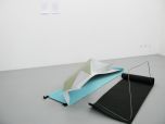
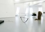
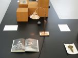
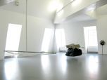
REVIEW of the exhibition by David Catherall Finding a balance: Virtuoso and the origin of material Conditions of display and methods of presentation are core values when considering the reception of objects and images in the material world. Surface, lighting, colour, texture, are all perceptive concerns in relation to the mediation of language between passive consumerism and intense receptivity. Sensation, reaction, and stimulation are a language used to interpret or compel the visual and physical qualities of representation and vernacular. This applies to the silhouette created when shadows of bureaucracy intervene in the celebration of aesthetic pleasure, beauty, and tact; leisure, and exchange with that of the industrial, manual, work-force; labour. Throughout the joint exhibition of Nora Schultz and Pernille Kapper Williams, investments have been made into digging up the groundwork of frame and display techniques and their related economies of production. These economies refer directly by and large to material concerns of movement between historic decorative design objects, and industrial manufactured building materials, both intrinsically connected to commercial, social, cultural values as well as those of artistic merits and practise. Positioned within this crux, democracy appears to level-out the prosaic hierarchy of excess and function in the sense of an imbalanced ratio of experience and reflexivity. This exhibition reads like a magazine spread or a trade catalogue of a semi-public showroom, a layout of carefully selected things; crafted, built, collected, assembled, ranging from the lineage of process and manufacture; prototype, production, display, documentation. The governing conditions of display exist in the promotional potential of leisure and the appreciation / speculation for imagined living is embedded in the framing devices and mediation of language between object, surface and presentation. Read as a three-dimensional un-folding of pages, reveals the layout and textual-visual components that emit particles of information and control the situation like an editorial gesture, what material goes in and what stays out, how it is finished, and how it is arranged, henceforth what is communicated and what is elucidated from these pages. The use of certain display, hanging, framing devices regarding the set of works by the two artists give the general impression of finding ‘its’ own balance as an exhibition that acknowledges the demands of the neutral contemporary conditions of presentation and the value of historic tropes. The shiny, flawless ‘L-shaped’ pedestal that Kapper Williams employs as a framing device for Du Bon Ton (2009), coated in blackboard paint, resembles powder-coated steel, adorned with dovetailed stained wooden boxes, glass mounts for images and texts, perspex bookends and the illumination of artificial light from the copper lamp is reflexive in what materials (in both sense of the word, subject and physical) she chooses as furnishings. Here we are confronted with a plethora of historic visual information that illustrate the furnishings and finishings of the economy that they represent. A selection of pre-existing antique paper-ephemera, books, illustrations, hand blown glass, marbled samples and various other art deco artefacts, all polished, lacquered, and buffed, reflect the surface of the device that accepts them, the plinth and the wooden display cases. The language of display lends itself historically from the mercantile presentations of commerce and its associated values of taste and acquisition. These objects on display offer an idealism or a redefinition for a modern approach to metropolitan life, encompassing aspects of an everyday existence that potentially narrate various fictions and fantasies of the aspiration and the desire to surpass the banality and commonplace of generic consumerism. It operates in-between space of authorship and readership using specifically, fashion designer and entrepreneur Paul Poiret and the exclusive Parisian magazine Du Bon Ton, as twentieth-century progenitors of rebellion towards the industrial, mass-produced commodities to produce a dialogue with how contemporary models invest this vocabulary as propaganda towards hedonism. The Way We Move (2009) and Untitled (Duster) (2009) appeal to the Bourgeois reception of beauty in terms of apparent authenticity; The fabrics are a twenty-first-century re-make of a design based on an original Poiret jacket from the 1920s which has been re-constructed through digital manipulation of photographs, and the Ostridge-feather duster a new product meant to look vintage available from the retailer Manufactum which specializes in home and decoration products advertised as being produced in the tradition of German craftsmanship, as drag-act of feigning elegance. Like the gloss of the magazine, the plinth showcases a similar logic- as a visual documentation of high society in twentieth-century European capitalism, unsure of its own authenticity. Coercely Nora Schultz’s abstracted bent, cut and folded metal forms resembling chairs, automobiles, beach mats, and a hammock displace this treatment of material. In Ergodynamische Stühle (2009) (lit. Ergonomic Chair) iconic frames of Marcel Breuer’s Bauhaus tubular steel chairs become the literal frame to present curved metal sheets portraying ironic ‘ergonomic designs.’ Built around the measurements, dimensions and physical properties of the chairs structure itself, the metal sheets conform to these specifications as a pre-defined context and set of rules that determine what is perceived as ‘chair’ and that of ‘ergonomic,’ suitable for sitting in for prolonged periods of time, the body is supported in theory by the structure which accepts it, eliminating physical effort. However, the sheet metal formed around these structures offer no logic into functioning as such, the reception is purely visual, comfortless as they take on the appearance as a shell, sketch, or prototype under development. They possess elements of formal behaviour as to what ‘chair’ implies – bent, curved, to the proportions of the frame, metal upon metal shaped inside and out around the frame to connect them as a unified thing. The language of structure is animated by the presence of human activity by inserting the ‘originality’ of the ‘work’ into ‘frame,’ as signifier of expectance of ease. The origin and treatment of materials is attributed to the presentation of such in the transcendence of the static potential of visual culture to solely occupy the aesthetic realm and that of commodity capital. In this exhibition these concerns offer a complex rendering of contemporary economics of a capital structure defined by the labour division and its contended contributions to modernity. Idealism and the subsequent ordering and arranging of spatial and social conditions form the relationships that in turn comment on the formal properties of products and inter-linked parallels to form itself, in a contradictory nature of acceptance and denial continually in play and in dialogue. To elaborate, formal components and social-cultural legacies interact under the brief headline of ‘contemporary art’ amidst the current international hyper-paced buyer’s market of subjectivity and information exchange. In this case the viewer is bombarded with a plethora of shapes, sizes, colours, and textures that evoke a sensual-visual experience of tact and pleasure in the physicality and tangibility of beauty and potential desire. The subtle relationship between the work of the two artists in this exhibition exists in the mediation of approach and interaction towards the origin and treatment of materials within the realm of production and presentation. This can be seen as an experimental dialogue that is focused on a circulation of objects in conflict with the authority of creation, the formal and material structures of observation and creation, and the concealment and revelation as such. Car with Cancer (2009) by Schultz resembles the shape of a car suspended from the ceiling, the body, shell, or frame of a vehicle intended as the façade, the exterior protection of interior space in its basic form, bearing the weight of a solid black mass – cancer, pulling it down, an incomplete whole, the surplus, excess of unnecessary material impeding the function and performance of the interior; ornament without decoration, superfluous, overpowering, negative positive space. Again, in Car Collage (2009), the image exhibits the literal frame of contemporary luxury goods- devoid of their markings, labels and wholeness through the cut-out subtractive rendering of two-dimensional space; reductive rendering as a transparent three-dimensional exterior, a hollow skeleton, matter-less, fragile, the corrupted body without interior form, under production, half-formed. The manipulation of subtractive handling, the removing of space, removing of surface, removing of content elucidates positive and negative space, black and white, as the diminutive violation of production. In the case of Car With Cancer, the black mass of steel can be regarded as the surplus material or the un-wanted / un-needed growth impeding function. The A4 text sheets Untitled (Tableau DCCVII & Tableau DCLXXIII) by Kapper Williams remove the surplus from decoration as a German – English translation of titles given to colour, properties and attributes that physically describe the palette of language pertaining to the visual senses. They exist as the universal language that translates as the fundamental building blocks to visual construction and analysis of formal qualities in objects and images. This applies in reference to printing and design industries; adjectives that affix a concrete meaning, and have a mathematical value of pigment, luminosity, saturation, and hue; additive renderings. Likewise, the isolation of the Du Bon Ton illustration plate titles aestheticize typographic fonts, and include their own set of rules and dimensions; curves, angles, and lines that add visual elements literally to language. Separated from their origins, they contextualize the significance of descriptory functions of imagery in terms of associative values of connotations with the illustrations. Titles such as The Embarrassment of Paris, and Do Not Tell generate projections into the aforementioned narratives and judgements placed on the values of products. Holding the relationship of image and text together, the books Who’s Who in Graphic Art and Ornamentik operate as collections of paper that contain the excess of ornament and decoration as a portfolio or lexicon of international styles and accomplishments, collections of knowledge and information bound in the documentation and representation of photographs, texts, and footnotes. Commentary II Formalism, the structure to determine a systematic procedure to approaching the production of things considering scale and material of how they are to be manufactured and displayed; a procedure here that implies a representational approach and that of establishing an equilibrium towards manufacture and presentation. Rationalized decision-making sets a criteria on how these procedures occur, what is available on the market, and how these demands fit the site or context of presentation. Congruent with performance, things are manifested and exhibited simultaneously, such is the case with various working methods in this situation, collecting and forming materials to a simultaneous pre-determined visualisation open to interpretive intervention. First, materials collected ‘on site’ one of these economies is based on what is readily available in the local environment, research is not a major part of the accumulation process, but is substituted by needs for what are within the means of local building suppliers and DIY stores, leftovers from building sites, and collections from hunting and gathering type findings. Size and scale is dictated by the ability to manipulate these supplies by use of hand or basic tools often used by DIY enthusiasts, or therefore within the economy of the democratic. Second, programmation of source and accumulation of sought out virtuoso of a particular field- acquired value that exists within an economy of exchange- ideas, objects, commerce, simulates the role of the connoisseur. Nevertheless, the balance, dialogue, and mitigation between leisure/labour, democratic/aristocratic, and decorative/functional is the bureaucratization of language and its role in the formal structure of the methodology of a visual, sensual, and tangible approach to display and presentation that affords us the luxury of experience and reflexivity.
|

